Element / London / 2021
Conducted a 2 month long diary study to redesign homescreen and navigation to cater better to both - new and power users.
Making the communication on the app, Element, ‘just work’ for both new and power users by providing them with the ability to edit their home screen layout based on their distinct needs.

About
Element is a B2B secure messaging platform
An open source platform built for privacy focused government agencies like US Navy, NATO, United Nations, German Armed Forces and UK Ministry of Defense.
Runs on a decentralised communication standard called Matrix, that has 110 million users worldwide.
Products include a web experience, mobile app, video call and admin tools.
Problem
How might we better cater to new and returning users?
In 2021, the navigation experience on Element’s mobile apps was complicated, fragmented and cluttered.
Our daily active users were stagnant and we were unable to increase our rentention of new users. Our team was tasked with understanding current issues with the mobile and how could the experience be improved.
We spent the first 3 months researching and defining our solution in collaboration with our users, and 4 months developing, testing and shipping.
Oppurtunity
It’s time for a complete redesign
To increase user adoption we needed to rebuild and redesign the mobile app to get it on par with competitors and in line with user expectations.
This gave us a chance to uplift the tech stack, implement native app design and create a new, more efficient and accessible design system.
We called this redesigned app Element X, which would eventually replace the current mobile apps.
Role
Leading research and design
I led design and research on the project, working with various stakeholders to bring this concept to life.
I paired very closely with the product manager, iOS and Android developers and later with a QA analyst to ship this solution.
Initial process and insights
-

UX audit and heuristic evaluation
The navigation model for iOS and Android was widely varied and thus increasing the time and effort it took to design and maintain our effort. Internally we wanted to align these apps for easier deployment and iteration
-

Unmoderated testing
We learnt that noticed that there was a high learning curve for a first time user on the app, which was making it difficult to grasp all that our platforms have to offer.
-

Reviewing community feedback
We observed that users were having a hard time finding their conversations and knowing when they were inside a space (like a workspace in slack)
Design Principles
🎚️
Make the app flexible so it caters to different needs of our wide user group - new and power
🔮
Account for scalability so the proposal accommodates for future features eg. multi account
🪄
Use progressive disclosure to slowly introduce users to our offerings - to simplify the app
🤏
Make sure that primary, most often used actions are within reach of the user at all times
Approaching the problem
-

Exploring different interaction models
Once we had a good understanding of how people were using Element, we spent a lot of time drawing, redrawing, and iterating on several different proposals of how we might improve and simplify our home screen for all our different user groups (which stretches from individuals, through to communities, small and large businesses, and entire governments).
-

Breaking down the proposal into smaller prorotypes
To valid our concept, we broke down the IA components on the home page to four distinct key flows that would test the navigation model: space switching, edit layout, invites and start a chat. We invited community members, and customers to join us for several different research sessions and collected over 300 pieces of feedback.
-

Learning by conducting a month long diary study
For our highest risk features, we deployed new builds to test over a period of time. A lot of IA changes are about forming habits so we knew that a one time test wouldn’t give us the answers we were after. For that reason, we chose to conduct a month long diary study where we carefully chose participants. I wrote the script for prompts everyday and collected valuable feedback.
-

Iterating based on learnings
We set out qualitative and quantitative metrics to measure success of our experiments. We used the SUS framework to measure usability of the app before and after the experiments were done. This gave us a good idea of how well the concepts would perform. We also asked them qualitative questions each day during the study which gave us a good idea of what was working and what had the potential to improve.

Development and launch
-

Community testing
For final validation, we conducted a testing session with our very active community. This helped us find various bugs and edge cases which might have gone unnoticed otherwise. This way to gathering feedback was so successful that it became a general practice at Element.
-

Release plan
While development was going strong, we started creating a release plan for the project. This included creating an end-to-end release experience for the users, so they didn’t feel abandoned by the change.
-

VoiceOver text for accesibility
Along with making sure the designs were pixel perfect, we also took time to make sure the VoiceOver text was easy to understand so visually impaired people could also access the app easily
The Solution - Key features
Feature 1
Removing bottom navigation
Previously, when users open their phones to find a chat, or respond to a notification, it could take several clicks to find the right tab and access the right one (and sometimes chats weren’t where you expected or wanted them to be.)
For that reason we got rid of the bottom navigation to show a simple list of direct and group chats, all in one list - similar to WhatsApp or iMessage.
Reasons to believe this would work:
Leveraging incredibly familiar and simple UI for chat list to make it easy for a new user to send their first message .
Reducing cognitive overload for a user by progressively disclosing features.
Removing confusing spatial models like before when user could navigate using both a left panel and bottom tabs .

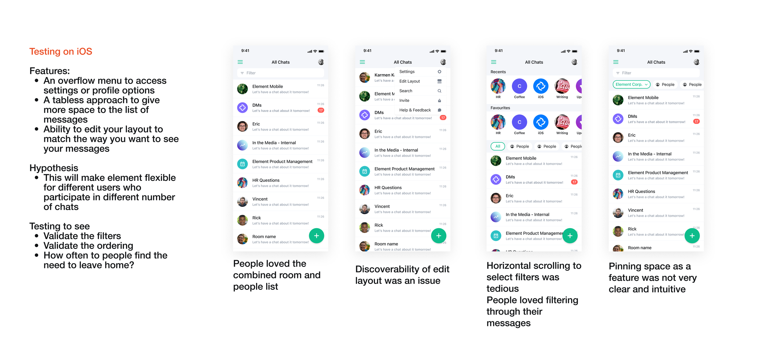
Feature 2
Edit Layout
For seasoned users, a simple list of direct and group messages might not be enough. So, by using the Edit Layout feature, users can activate ‘Filters’ that sorts their list into Unread, Favourited and People.
Users are also given a choice to toggle on ‘Recents’ list which allows them to see or hide their most recently viewed rooms.
Reasons to believe this would work:
Giving users the ability to customise their homepage based on their needs allows us to better understand how people navigate their chats.
Fluidity and scalability of filters makes it easy for us to provide users with further customisation in the future.

Feature 3
Easier access to spaces
Spaces is like Workspaces in Slack. Previously hidden in the hamburger menu, users were finding it tedious to move between them.
For that reason, I removed the hamburger menu and instead brought Spaces down to the bottom left on iOS and bottom right on Android making it easier to access, while following platform specific guidelines.
Reasons to believe this would work:
Reducing reachability concerns with growing sizes of phones
Using proven, OS native interaction patterns eg. iOS mail

Outcome
Increased DAU by 15%
Increased the daily active users on iOS by 16% and on Android by 13%
Improved the experience for the first time users by having a simpler layout for the home screen, which can be made more complex based on user’s power level
Made it easier for our users to move from one platform to another, by keeping the layout familiar - a special use case for some of our clients
Key Learnings
Involve stakeholders early in the process through research
This project made me grow as a designer like no other project. I was successfuly able to get stakeholders on board to conduct a new lengthy research method, diary study, to validate our solution which the company was not familiar with.
More than hard skills, it really tested my soft skills - how to adapt to different working styles of different engineers, how to document decisions and how to resolve misalignments, particularly while coordinating with senior leaders and across disciplines.